GUI - Faces
VID DLS base
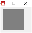
Most basic face. It may be used to create other faces. By default, it will only display a gray background.
Red [needs: view]
view [
base
]
box and image
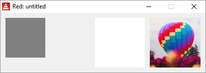
Strictly speaking, these are not faces, but styles of the base face. box is a base with a default transparent color and image is a base that expects and image! option, if none is provided, an empty image with white background is provided.
Note: the default sizes for a base and box is 80x80, but for an image, is 100x100.
Red [needs: view]
view [
base
box
image
image %smallballoon.jpeg
]
facets:
When Red interprets the code and finds a face, it looks for one or more of the following datatypes after it. Each has a meaning that will change the appearance of the face displayed. Their use will be made more clear in the examples of faces given ahead.
From Red's documentation:
Datatype |
Purpose |
integer! |
Specifies the width of the face. |
pair! |
Specifies the width and height of the face. |
tuple! |
Specifies the color of the face’s background. |
issue! |
Specifies the color of the face’s background using hex notation (#rgb, #rrggbb, #rrggbbaa). |
string! |
Specifies the text to be displayed by the face. |
percent! |
Sets the data facet (useful for progress and slider types). |
logic! |
Sets the data facet (useful for check and radio types). |
image! |
Sets the image to be displayed as face’s background. |
url! |
Loads the resource pointed to by the URL. |
block! |
Sets the action for the default event of the face. |
get-word! |
Uses an existing function as actor. |
A list of facets copied from the documentation is given at the end of this chapter.
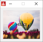
So, using facets with the base face:
Red [needs: view]
view [
base "HELLO!" 130x100 %balloon.jpeg ;balloon.jpeg is an image saved on the same...
] ;...directory as you Red executable.
text face and text facet
There is a face named text and the text facet.
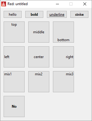
About the facet: text facets can be set in most faces and it can be formatted both in style and in position on the face. The following code...
Red [needs: view]
view [
button "hello"
button "bold" bold
button "underline" underline
button "strike" strike
return
button "top" 70x70 top
button "middle" 70x70 middle ;vertical
button "bottom" 70x70 bottom
return
button "left" 70x70 left
button "center" 70x70 center ;horizontal
button "right" 70x70 right
return
button "mix1" 70x70 top left
button "mix2" 70x70 top center
button "mix3" 70x70 top right
return
button "No" 70x70 right bold ; does not work!
]
... generates:
VID DLS text
The event that triggers the default actor is a click (see action facets)
Red [needs: view]
view [
text "Hello"
]

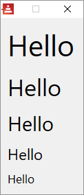
Although h1, h2, h3, h4 and h5 may not be proper faces (they are styles), I think I should describe them here as they are text faces with different font sizes and are quite handy if you are working with text:
Red [needs view]
view [
below
h1 "Hello"
h2 "Hello"
h3 "Hello"
h4 "Hello"
h5 "Hello"
]
the font object
Maybe you already tried to set a color to your text and noticed that just adding, say, blue after the text face makes the background blue, but not the text. To format the font used to display strings on faces, there is this thing the documentation calls "font object". Think of it just as a set of commands to format the font. You write them after you declared your face, along with other facets.
font-name <Valid font name installed on the OS>
font-size <Font size in points>
font-color <Font color in R.G.B or R.G.B.A format, or its name>
You can also add bold italic underline or strike.
So:
Red [needs: view]
view [
text "hello" font-name "algerian" font-size 18 font-color red bold
text "hello" font-name "algerian" font-size 18 font-color blue
text "hello" font-name "broadway" font-size 15 font-color green strike
text "hello" font-name "arial" font-size 12 font-color cyan underline
]

VID DLS button
The event that triggers the default actor is a click.
Red [needs: view]
view [
button
]

action facets
Most faces allow an action facet, that is a block of commands that is triggered by an event. That event may be a mouse click (called "down" in Red), or something else, like pressing pressing enter or making a selection.
For buttons the action facet trigger is "down" event (mouse click) and in the following example it triggers the quit command that exits the program.[quit] would be the action facet ( Should I call it the default actor?, you can set you own actors as described here).
Red [needs: view]
view [
button 50x40 "click me" [quit]
]

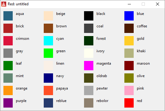
colors
If you run the program below...
Red [needs: view]
view [
base 30x30 aqua text "aqua" base 30x30 beige text "beige"
base 30x30 black text "black" base 30x30 blue text "blue"
return
base 30x30 brick text "brick" base 30x30 brown text "brown"
base 30x30 coal text "coal" base 30x30 coffee text "coffee"
return
base 30x30 crimson text "crimson" base 30x30 cyan text "cyan"
base 30x30 forest text "forest" base 30x30 gold text "gold"
return
base 30x30 gray text "gray" base 30x30 green text "green"
base 30x30 ivory text "ivory" base 30x30 khaki text "khaki"
return
base 30x30 leaf text "leaf" base 30x30 linen text "linen"
base 30x30 magenta text "magenta" base 30x30 maroon text "maroon"
return
base 30x30 mint text "mint" base 30x30 navy text "navy"
base 30x30 oldrab text "oldrab" base 30x30 olive text "olive"
return
base 30x30 orange text "orange" base 30x30 papaya text "papaya"
base 30x30 pewter text "pewter" base 30x30 pink text "pink"
return
base 30x30 purple text "purple" base 30x30 reblue text "reblue"
base 30x30 rebolor text "rebolor" base 30x30 red text "red"
]
...you get:
faces are objects
Each face is a clone of the face! template object and you can change their attributes (the facets) during runtime:
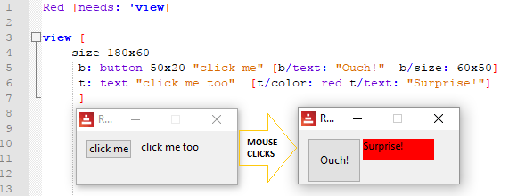
Inside the action facet, you can refer to a face's attribute using face/<attribute>,so:

Run the script below and click the button to have an idea of the complexity of a face like a button:
Red [needs: view] view [b: button [print b]]
VID DLS check
Red [needs: view]
view [
check
]

The event that triggers the action facet is a change. The current state is in the attribute /data (true or false)

By the way, that is not proper coding style, just seems more didactic. Take a look at Red's Coding Style Guide.
VID DLS radio
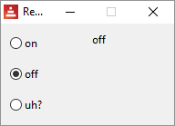
The event that triggers the action facet is a change. The current state is in the attribute /data
This type represents a radio button, with an optional label text, displayed on left or right side. Only one radio button per pane is allowed to be checked.
Red [needs: view]
view [
r1: radio "on" [t/text: "on"]
t: text "none"
return
below
r2: radio "off" [t/text: "off"]
r3: radio "uh?" [t/text: "uh?"]
]
VID DLS field
To input text data.
The events that triggers the action facet is enter. The current state (the text inside the field) is in the attribute /data. _This works both ways: if you change /data, the text displayed in the field is changed. Trying to change /data_ with code inside the view block but outside the action facet gives you an error.
Red [needs: view]
view [
field
]

This example prints your input on the console when you press enter:
Red [needs: view]
view [
f: field [print f/text]
]
field allows a no-border facet*:
Red [needs: view]
view [
f: field no-border
]

*Just so you know, in Red's documentation they call no-border a "flag", not a facet.
VID DLS area
The event that triggers the action facet is a change. The text inside area is in the attribute /text. You may change the text assigning strings to /text.
Red [needs: view]
view [
area
]
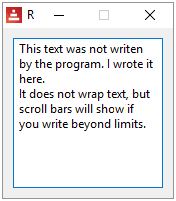
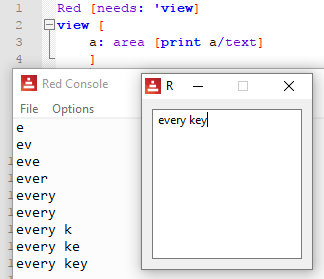
Since any change is a triggering event, every keystroke inside the area executes the action facet:
VID DLS text-list
The event that triggers the action facet is a selection. The strings to be listed are in the attribute /data. The index of the selected data is in the attribute /selected
Red [needs: view]
view [
tl: text-list 100x100 data[
"Nenad" "Gregg" "Qtxie" "Rebolek"
"Speedy G." "Myke" "Toomas"
"Alan" "Nick" "Peter" "Carl"
]
[print tl/selected]
]
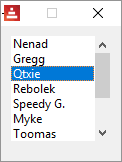
3
To use the string selected, the code snippet could be:
pick face/data face/selected
This would be the same as : pick ["Nenad" "Greg" "Qtxie" "Rebolek" (...)] 3
VID DLS progress
I don't think it allows an action facet, it's just a display. The current state is set in the attribute /data, as a percent! or a float! between 0 and 1.
Red [needs: view]
view [
below
text "Enter percentage"
text "0 - 1 (float):"
field [p/data: to percent! face/data]
p: progress
]
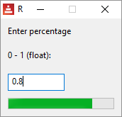
VID DLS slider
The event that triggers the action facet is a change. The current percentage is in the attribute /data , as a percent! datatype.
Red [needs: view]
view [
title "slider"
t: text "Percentage"
slider 100x20 data 10% [t/text: to string! face/data]
]
Move the slider's cursor to see the percentage data:

VID DLS panel
Creates a new area where you can display faces using the same syntax explained so far. I think the example below is self-explanatory. Does not seem to allow an action facet.
Red [needs: view]
view [
panel red [size 100x120 below text red "Panel 1" check button "Quit 1" [quit]]
panel gray [size 100x120 below text gray "Panel 2" check button "Quit 2" [quit]]
]
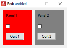
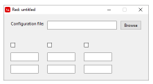
An important use for panel is to create nicely formated GUIs without using too many at commands. For example, to create the layout below, you could use two panels, one for the upper part and another for the lower part:
VID DLS tab-panel
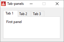
Creates a set of panels where only one can be seen at a given time, selected by a tab. Does not seem to allow an action facet. Data is at: <tab-panel>/data - Block of tabs names (string values).
<tab-panel>/pane - List of panels corresponding to tabs list (block!).
<tab-panel>/selected - Index of selected panel or none value (integer!) (read/write). i.e. the panel that has the focus, 1 for the first, 2 for the second and so on.
Red [needs: view]
view [
Title "Tab-panels"
tab-panel 200x100 [
"Tab 1 " [text "First panel"]
"Tab 2 " [text "Second panel"]
"Tab 3 " [text "Third panel"]
]
]
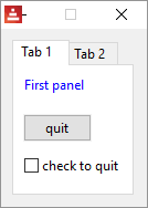
And each panel allows a set of faces:
Red [needs: view]
view [
Title "Tab-panels"
tab-panel 110x140 [
"Tab 1 " [
below
text font-color blue "First panel"
button "quit" [quit]
check "check to quit" [quit]
]
"Tab 2 " [text "Second panel"]
]
]
VID DLS group-box
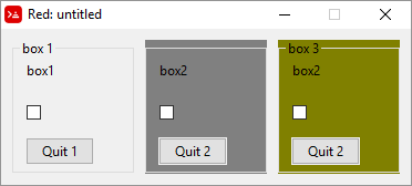
From documentation: A group-box is a container for other faces, with a visible frame around it. This is a temporary style which will be removed once Red has the support for edge facet.
Seems to me it it's just a panel with a border. I noticed it gives strange results when you give it a color:
Red [needs: view]
view [
group-box "box 1" [size 110x120 below text "box1" check button "Quit 1" [quit]]
group-box gray [size 110x120 below text "box2" check button "Quit 2" [quit]]
group-box "box 3" olive [size 110x120 below text "box2" check button "Quit 2" [quit]]
]
VID DLS drop-down
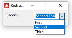
The event that triggers the action facet is enter.
From the documentation: "This type represents a vertical list of text strings, displayed in a foldable frame. A vertical scrollbar appears automatically if the content does not fit the frame. The data facet accepts arbitrary values, but only string values will be added to the list and displayed. Extra values of non-string datatype can be used to create associative arrays, using strings as keys. The selected facet is a 1-based integer index indicating the position of the selected string in the list, and not in the data facet."
You can type text in the text-box. The content of the text-box will be in the attribute /text. It will show when you press "enter"
Red [needs: view]
view [
t: text "-->"
drop-down "Choose one" data [
"First"
"Second"
"Third"
] [ t/text: pick face/data face/selected ]
] ;must press enter to change text
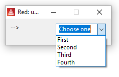
Here is an example using events:
Red [needs: view]
view [
t: text "-->"
drop-down "Choose one" data ["First" "Second" "Third" "Fourth"]
on-change [ t/text: pick face/data face/selected ]
]
VID DLS drop-list
The event that triggers the action facet is change.
Similar to drop-down, but you cannot write in the text box and it does not show a default text.
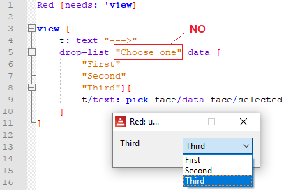
You can, however, give it a default selection by specifying e.g. select 2 :
Red [needs: view]
view [
t: text "-->"
drop-list "Choose one" select 2 data [
"First"
"Second"
"Third"
] [ t/text: pick face/data face/selected ]
]

VID DLS menus
menu is a facet, but I believe that who is learning Red wants to know "what are the widgets available for Red", and menu looks and feels like a widget to me. Since throughout helpin.red I mention that Red's widgets are called "faces", I think it deserves an entry as one, even though technically it may be something else.
It's very poorly documented. Toomas Vooglaid kindly provided a few examples of the use of menus. The first is a rewriting of an example taken from Nick Antonaccio's Short Red Code Examples (I suggest you take a look at that excellent webpage), but using only VID:
Red [needs: view]
view/options [area 400x400] [
menu: [
"No Submenus" [
"Print" prnt
---
"Quit" kwit
]
"Sub-menus" [
"Sub-menus" [
"Submenu1" s1
"Submenu2" s2
"Submenu3" [
"Submenu4" s4
]
]
]
]
actors: make object! [
on-menu: func [face [object!] event [event!]][
if event/picked = 'kwit [unview/all]
if event/picked = 'prnt [print "print menu selected"]
if event/picked = 's4 [print "submenu4 selected"]
]
]
]

The second example is a simple framework of a text editor using menus:
Red [title: "Menus" needs: 'view]
view/options [editor: area 500x300][
menu: ["Main" ["Open..." open "Save as ..." save-as "Save" save]]
actors: object [on-menu: func [face event /local new-name][switch event/picked [
open [if new-name: request-file [editor/text: read editor/extra: new-name set-focus editor]]
save-as [if new-name: request-file/save [write editor/extra: new-name editor/text]]
save [write editor/extra editor/text]
]]]]

The third example makes a menu appear when you right-click on text:
Red [needs: view]
view [text "Try menu" with [
menu: ["Change text" change]
actors: object [on-menu: func [f e][
switch e/picked [change [
view/flags [text "Please enter new text:" field [
f/text: face/text unview
]][modal]
]]]]]]
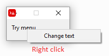
This last example can be rewritten using on-menu event:
Red [needs: view]
view [
text "Try menu"
with [menu: ["Change text" change]]
on-menu [
f: face
if event/picked = 'change [
view/flags [
text "Please enter new text:"
field [f/text: face/text unview]
][modal]
]
]
]
VID DLS camera
Displays a camera stream.
Red []
view [
cam: camera 130x100 select 1
]
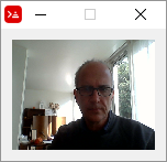
This script saves a snapshot of the camera stream as as .jpeg image:
Red []
count: 0
snapshot: does [
load rejoin [mold '% 'picture count: count + 1 '.jpeg]
]
view [
cam: camera 120x100 select 1
button "Save picture" [save/as snapshot to-image cam 'jpeg]
]
Facets according to Red's documentation:
Facet |
Datatype |
Mandatory? |
Applicability |
Description |
type |
word! |
yes |
all |
Type of graphic component |
offset |
pair! |
yes |
all |
Offset position from parent top-left origin. |
size |
pair! |
yes |
all |
Size of the face. |
text |
string! |
no |
all |
Label text displayed in the face. |
image |
image! |
no |
some |
Image displayed in the face background. |
color |
tuple! |
no |
some |
Background color of the face in R.G.B or R.G.B.A format. |
menu |
block! |
no |
all |
Menu bar or contextual menu. |
data |
any-type! |
no |
all |
Content data of the face. |
enabled? |
logic! |
yes |
all |
Enable or disable input events on the face. |
visible? |
logic! |
yes |
all |
Display or hide the face. |
selected |
integer! |
no |
some |
For lists types, index of currently selected element. |
flags |
block!, word! |
no |
some |
List of special keywords altering the display or behavior of the face. |
options |
block! |
no |
some |
Extra face properties in a [name: value] format. |
parent |
object! |
no |
all |
Back-reference to parent face (if any). |
pane |
block! |
no |
some |
List of child face(s) displayed inside the face. |
state |
block |
no |
all |
Internal face state info(used by View engine only). |
rate |
integer!, time! |
no |
all |
Face’s timer. An integer sets a frequency, a time sets a duration, none stops it. |
edge |
object! |
no |
all |
(reserved for future use) |
para |
object! |
no |
all |
Para object reference for text positioning. |
font |
object! |
no |
all |
Font object reference for setting text facet’s font properties. |
actors |
object! |
no |
all |
User-provided events handlers. |
extra |
any-type! |
no |
all |
Optional user data attached to the face (free usage). |
draw |
block! |
no |
all |
List of Draw commands to be drawn on the face. |
